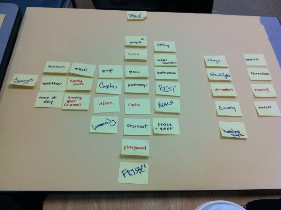
This week in class we learned about a few different techniques for mapping data. The technique that strikes me as most useful in our project is affinity diagram mapping. Listing off all possible thoughts about the space we’re researching, and then finding connections between those thoughts is useful because it brings to light a lot of connections that one might overlook otherwise. Once we had all of our thoughts written out and clustered, the physicality of our thoughts on sticky notes made it a lot more obvious which areas we were thinking about the most, and the least.
Having to sort through words and thoughts and deciding which relate to what, and putting them in categories was useful, but I think a next step in the affinity diagram we completed would be to further relate the ideas together, relating each cluster to the others, and ask questions such as “why is this important?”, and maybe looking at a sort of hierarchy of each cluster.
The IDEO research method I am interested in utilizing in respect to our project is “Cognitive Task Analysis” and it falls under the “learn” category. Cognitive task analysis would be a useful research method for our project because we are creating an interactive mobile app. For us to better understand what works or not, or which aspects need to be worked upon, we would need to analyse how our user approaches and reacts to each aspect.
In application design, understanding how a user uses the application and makes decisions is important to create a satisfying experience.
In Christopher Frayling’s paper Research in Art and Design, he is trying to show that modern research, for art and design, do not have to be what one typically thinks of “research”. It is simply “searching”.
Frayling also point out that there are differences between research pertaining to art and design. There are three different types: Research into art and design, research through art and design, and research for art and design.
Historians are now (in 1993) emphasizing the links between the “experimental scientists and the creative artists”. Both the scientist and the artist fall short where the other is strong, thus the hybrid, or collaboration. This is also where the three different categories are born. They are different methods of research, because they have different goals or motives.
Research into art and design
The most common out of the three. There are numerous models and archives to base your research off of. It can lead to historical research, aesthetic or perceptual research or research into theoretical perspectives relating to art.
Research through art and design
The second most popular method of research, and this sector can lead into materials research (materials used in the work), development work (innovation, customization), and action research (step-by-step of practical research to show the results).
Research for art and design
Gathering materials and creating something with that research in mind. “Research that produces an artefact.” The research is “embodied” within the artefact, to conceptually show the research results
In class this week, we took a different approach to brainstorming. We started with a very broad frame, “Toronto Public Parks”. From here we took steps to frame a problem – to which we will eventually propose a solution. To start, we proposed the question “how can a park be more like a __________?” and had a brief timeframe to write down as many items as possible, as wild as possible, and then shared our ideas between our words. We found some common themes or words between the three of us, and refined our lists to items we liked the most or worked the best (not necessarily in a traditional way of “working”).
How can a park be more like a horror movie?
How can a park be more like the Internet?
How can a park be more like a Haven?
From here we were instructed to consider what we use a park for, and what we are “hiring it to do”.
At this stage you can sort of evaluate what sort of turn your idea is going to take, which direction it is leaning towards, but solutions come later (this was the hard part). If we found ourselves coming up with premature solutions, we just jotted them down on the side, but disregarded them for now.
Finally, we came up with a list of “stakeholders” and public spaces have a very large list of stakeholders.
At the end of this exercise, we came up with a rough “opportunity statement”, which we will work at and refine over the course of this project.
“How might the public enable entertainment using technology to create exploration of imagination and attract public use?”
The location that our group analyzed was the Tim Horton’s located in Kerr Hall near the pathway to RCC. This particular coffee stop very easily gets over congested with patrons on class breaks, or in between classes. It can be a great inconvenience to those who just wish to order one beverage, or people who simply are trying to get through the pathway on their way to class. The location of the coffee shop could have been more well thought out in that respect. The main issue is the large line up that forms on breaks. To make the queue move faster, a few things could be changed.
Menu Display
The menu should face out towards where the queue forms so that patrons waiting can have an easier time choosing what they would like to have ahead of time. They should also point out in the form of a sign, that they do not accept card payments, or perhaps they should allow for card payments.
Express Coffee Vending Machine
Since some customers only wish to purchase one cup of coffee and no food items, perhaps a vending machine would allow for these individuals to serve themselves and insert cash or use cards to pay all in one machine. The machine would be simple, and only dispense certain beverages. These self-serve machines are seen more nowadays, such as in Neighbours Coffee shops (in gas stations), but they do not have built in payment. Adding the self-payment feature would allow for quick payment and quick receiving of drinks. This technical intervention would allow for the cashiers to focus on more lengthly orders (such as food or multiple items at once) and would move the queue much faster.
The entire experience of this coffee shop is dependent on other patrons and time, so this would help bring down the wait time, making the experience much more pleasant.
Location: Tim Hortons in Kerr Hall/RCC pathway
Group Members: Stephanie Redmond, Rachel Sulman, John Morgan, Deevanie Jethoo
Blast Theory are a group who focus on interactive media, and gaming ideas. A Machine to See with is an interactive piece where the user is connected to the work through their cellular telephone. An automated machine then instructs the user on what they are to do. It is basically an action movie that the user gets to star in. This piece, like many of Blast Theory’s, relates to the idea of reality mixed with a virtual reality, creating an alternate reality, a “game”. The themes revolve around virtual communities that you see in gaming, and uncertainty in trust. The work also plays on the theme of morality, seeing what choices an individual makes when questions arise, when the consequences are not necessarily theirs to keep. Unlike their previous pieces that we discussed in class, this work does not involve other players online, it is more individual based, giving a much more intimate and personal experience to the user.
I found Blast Theory’s work to be particularly interesting, because it offers what a real, technical video game cannot. It is real, to an extent. While the user is immersed in the suspense of the project, I’m sure it feels much more real than playing with a controller or keys would. Your body and mind are the navigator and like their artist’s statement says “The ending is up to you”.
Luc Courchesne explores the uses of 3D spaces and virtual reality. He explores interactive spaces in a 360 Degree manner, not only linear.
Living by Numbers (2001)
In his work The Visitor: Living by Numbers, he creates an interactive space where the user is able to navigate through a virtual word on their own terms by speaking a number and turning their body, which would take them on their desired path. The path the user decides to take reveals the narrative in a different way. It offers a limitless approach to narrative storytelling, whereas before, it was typically linear (whether it is backwards or forwards) in interactive spaces. This way of navigation allows for free will of the user, not just what the artist intended, each user can take away a different message or story.
I feel like this approach to tactile video and interactivity is best, because you, as the user, are allowed to venture and fully immerse yourself in the work. It is also not only a personal experience, but the viewers outside of the dome projector are able to see what you are seeing. (The video further demonstrates this).
Another piece by Courchesne is You Are Here. In this work, he also explores the use of 3D projections but in a different manner than in Living by Numbers.
You are Here, Luc Courchesne (2010)
This work again, immerses the user completely, but this time it immerses the whole body of the user, not just their upper body. It creates an environment for the user which is actually outside of where they actually are in the installation. The user has a han control and headphones for the audio component. In my opinion this approach to Interactive Installation is still effective for what it aims to achieve, which is a user guided exploration, but is less “real”. I only say that because with the voice navigation, you have no physical controller, just your own dictation, whereas the hand controller makes it more like a video game.
Both of these works are great examples of interactive installation and tactile video.


 Since some customers only wish to purchase one cup of coffee and no food items, perhaps a vending machine would allow for these individuals to serve themselves and insert cash or use cards to pay all in one machine. The machine would be simple, and only dispense certain beverages. These self-serve machines are seen more nowadays, such as in Neighbours Coffee shops (in gas stations), but they do not have built in payment. Adding the self-payment feature would allow for quick payment and quick receiving of drinks. This technical intervention would allow for the cashiers to focus on more lengthly orders (such as food or multiple items at once) and would move the queue much faster.


